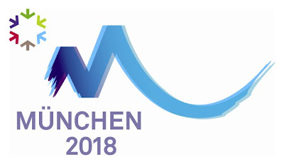
Today the Olympic committee introduced the three logos which made the cut to promote the games if Munich will indeed host the games. The people in Germany are asked to vote for the best logo.
Honestly, I’m not very impressed with any of these marks. They’re either too similar to previous logos, too blah or too trendy. The obvious problem with “trendy” designs is that it’ll already look too outdated way before 2018.
What do you think? Which logo design should represent the games in München?


5 comments:
I guess I'd have to pick the 3rd one. The first and second are so predictable and hoakey.
Well, the first logo reminds me of Logan's Run (Renew! Renew!) and the writing is vaguely Trekkish so that's a NO. The second made me put on my glasses for a closer peek and it still looked blurry and the little logo up top to the left reminds me of the Man and his World logo from Expo 67 here in Montréal so thats a NO. The third made me question our homeland flag - oddly, I don't remember the colours as Schwarz, Rot, Hellblau. What the hell is wrong with red? It's an Olympic colour! (Ooooh! I went to the Munich Olympics and the athletes all wore these darling little baby blue outfits - it's was to die for!) I don't think so! Allright Jimmy, it looks like you are going to have to design something yourself and send it in for a critique - I promise to be gentle.
the first is brilliant; uses the state colors, flag and pattern, captures the festive nature of munich and ties it up as a dynamic snowflake - and will work great in 1-color applications too. But there is never any excuse for having a public vote on design.
Brad and I were talking about München just last night. He has spent a couple of days there, but I have never been. Hopefully e`ll get to pay a visitin the next year or two.
I like how each of these logos incorporates elements from Bavarian culture.
Post a Comment